Showing posts with label Jovan Newman-Herry. Show all posts

Wednesday, 12 January 2011

4. What have you learned from your audience feedback?

The following video below is of myself and Mica another group member of my mine. Getting some feed back from other people after they saw our music video for the first time in Screen on the green in Angel Islington.

More feed back that i got from other people about my music video & ancillary print products:

"Lighting  great at times, some scenes not really visible great use. Great use of colour in the background. I loved the pace & speed of some clips, it really works well and fits the genre. Also the sweets on the lips shots works but some not in sync. However the location works & also fits the genre.-Sarah Jane"

"I like the use of green screen background, it matched beat of the song. Sometimes i think it was a little out of sync.The video had a lot of things going on in it which made interesting.-Callum"

"I loved the whole theme of your Digi Pack and advertisement it matched each other really well and i could see the connection between them and the music video.-Jasmine"

"The bright colours in your advertisement worked really well with each other and the text were suitable for each product, i liked it a lot well done.-David"


Below is a wordle brain Storm image which highlight's the most important words that keep on coming up in our feed back.This helped me to see which words come up more frequently than others to describe the good and  bad points of our music video and ancillary print products.


My thoughts on my feed back:

 After reading and hearing all the feedback about my music video, Digi Pack and advertisement. I have noticed that I received many positive and constructive comments about my work. One thing that stood out to my target audience is the use of colour through out all of my products it seemed like they loved the fact that my music video was extremely colourful and up-tempo. They also liked our unusual body swapping and the shot with the hundreds and thousands on it. They found it very interesting to watch and it reminded them of a real music video. So that part of the feedback was really, positive and I enjoyed hearing it. I also got some constructive feed back about bits that I could improve for example some parts of the video are slightly out of sink and that the artist performance could have been a lot stronger. When I watched back my video, I agreed with them. Therefore, if I were to do it again I would spend more time synchronizing up the track to the clips priestly. I would also make sure that the lead singer feels much more confident in front of the camera. I would do a quick warm up exercise to make her feel a lot more relaxed and chilled out. On a whole I believe that my feed back was very positive and that it made me look at my video in a different light.

3.How did you use media technologies in the construction and reasearch, planning and evaluation stages?

RESEARCH:
The Internet was an extremely helpful research method which allowed me to get a lot of background information about my products. I used Vimeo to look at other past students work as examples so that i could get some ideas about what i wanted my music video to look like. I also used Vimeo so that I could use screen shots of my own music video to analyse my work. I also watched many real music videos on YouTube in the same genre as mine. This was so that  i could see a good example of a music video and to see the main do's and dont's of pop/indie music videos. However i found google more helpful when it came to looking for examples for music advertisements and digi packs. This was because the search engine gave me a variety of examples in one place which saved me time for looking through alot of music magazines. In addition  facebook also helped me to find out all the latest information on what was in fashion right now when it came to pop/indie dress sense. This helped me create what kind of out fit "4LW" should wear. I also looked in music magazines such as Billboard magazines for music artist advertisements on there realise of there new album or tour. Blogger was also very useful to me aswell because it allowed me to see other members of my classes work and two see what stages they were at and if myself was on target.

PLANNING:
We used all the following things below to create my music video. They were all need at different stages of filming my music video if i did not have one of the items in the image below it could of had a huge affect on my music video and the shots we got for it.

As apart of creating our products we had to plan out what we was going to do before hand, this would allow us  to know what we wanted our Music video/Advertisement and Digi Pack to look like and plan every detail down before we started to create them so we knew what we was doing.  So to plan our music video we did an animatic, this was to show how we wanted our music video to look like and some scenes that it my contain. Due to the fact that we did our animatic at the beginning of starting our work. Some of the ideas that are in the animatic were not used due to the fact that we were not able to get the right location e.g: the restaurant scene was cut because we were not able to get the right location on time for filming. Also we found that scene extremely stereotypical so there fore we did not want to do it anymore. To help create my animatic i used digital a camera to take pictures of similar locations/situations that we wanted to use in our music video then. I uploaded it on to final cut pro and made a small animatic video to show what i wanted our music video to look like.
Animatic:


We also had to plan our Advertisement and Digi pack, before we could start creating it on photoshop. Below is my plan for my Advertisement and Digi Pack:


 EVALUATION:

While making my music video i used "Final Cut Pro" which is a key programme which allowed me to edit and put together my music video for "4LW". One  key tool i used was the "chroma key", I used this for the green screen shots. Originally i found it difficult to use the chroma key because it was hard to fine the right darkness level for the background to be fully back with out effecting the artist on the screen. But once i got the hang of it and found the right level and I copied and pasted the right levels on to each green screen shot. This made all the green screen shot levels consistent and easier for me to change the background colours.


Then i used the "Colour Picker" to change the background to a variety of colours. I did this by adding extra filters, and changing each colour of the filters to make the background a different colour. Once i had the right colours that i needed i decide to add some transitions between each colour to make the shot more interesting and make it seem like that things were going on around the artist. I did this by going into tools and effects and video transition's, from that i played around with a few different types of transition's till i found the right ones that suited my music video.
I also used the software hand breaker to convert my music video once it was finshed into a MP4 video so that it could uploaded on to blogger.


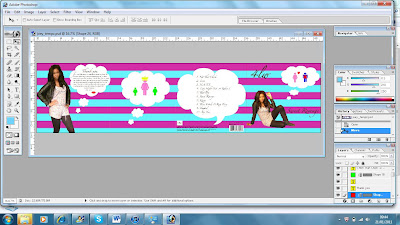
While making my Digi Pack & Advertisement i used  a software called "Photoshop Adobe" which is a key programme which allowed me to edit and create my products. In the screen shots below you can see me editing my Digi Pack & Advertisement.


To create the following products i had to use a varitey of tools on photoshop e.g:
-Magic Tool Wands
-Cropping
-Paint Bucket
- Shape tools
-Cloning tools
-Text to create the writing on the Digi Pack & Avertisement
-Cut
-Paste
-Font
-Size etc...
Some times i found the tools hard to use but once i got into it i found it easier to use.


2.How effective is the combination of your main product(video) and ancillary texts (digipak and advertisement) ?

1.In what ways does your media product use, your media products use develop or challenge forms and conventions of real media products?

 DICUSSING MUSIC VIDEO:
One music video that had a huge influence on our music video is Examples “Kick starts” video. I believe that this music video influenced a lot of the ideas that are included in our music video.  For example the whole “Fast speed” affect came from this music video. This was because we thought that as our song choice was very catchy and had a fast paste beat to it; Examples “kick starts” video would be a perfect representation on how we wanted the speed of our video. This included all the funky movements and quick cuts on the beat. Even though some of our cuts were not as fast as Examples I believe it fitted in with the whole pop/indie genre.


Another idea we took from the “Kick starts” video is the whole body swapping rotation happening. I liked this idea because it added to the funky theme of our video. Also because we wanted our video to look extremely different to other people’s music video so we thought we would think out of the box and do the body swapping idea. Which in the end we found extremely successful because we had a lot of positive feedback about it. However originally we wanted the body swapping backgrounds to have different colours on each background as soon as a different body part came in. However we tested out having the bright colours in the background and we thought it did not suit the theme we as going for throughout the video, therefore we decided to keep it green because it looked much better.


Another music video that had influence on my music video is Dizzie Rascal`s “I love you”. The main part of that video that caught my eye was at the beginning of the video were the main girl says “I love you” with the bright pink Barbie coloured lip gloss. I thought that was an amazing eye catching moment that my target audience would remember in my music video. So I copied the whole lips conventions in my music video. However to make it seem more edgy, funky & urban but still fit in With pop/indie style we decide to make the lips be covered in hundreds and thousands of sweets. This decision was made so that the audience would remember our music video at all times. We also added a little sparkle effect to the lips to make them look much more interesting. I believe that when it came to creating the music video we did not challenge a lot of conventions, this was because we wanted our target audience to recognise our music video under the pop/indie genre.


DICUSSING ANICILLARY PRINT PRODUCTS:
When it came to creating my Digi Pack and advertisement, I tried to keep it as simple as possible as possible, however I wanted them both to be able to link to the music video so that you can that tell they all come under one media product, which is the artist “4LW”. I don’t think I had huge amount of influence on my Digi pack & advertisement because I just looked at a variety of adverts & Digi packs and picked out the main denotations that I would need to use in my own product.  However Nicki Minaj’s “Pink Friday Album” had huge influence on my Digi Pack /& advertisement, even though she is from a different genre to my artist I believe her Digi Pack was a perfect representation on how to making women still look girly and sexy, but also making them look strong minded and like they are in control.


Also “The tings tings” Advertisement influenced my work because they made sure they incorporated the same colour scheme that they had in the “That’s not my name” video. This is the original music video to our song. I choose to do this so that you could still tell that our music video & ancillary print products matched each other and still had influence of off the original music video done by “The tings tings”.


Short list of fonts, colours, layout and design idea's (planning).

Fonts i might use:
Zapfino & times new roman

My layout:
simple/tidy/match with the video
Colours i might use:
OrangeYellowPinkPurpleBlue
I will use some of the colours listed above, as I want to stick to the colour theme but not all of the theme because it will to tacky and over the top.


My final Digi Pack (Production)

The following image below is of my final Digi Pack:

Mock up of My Digi Pack

The following images below are the mock up of my digi pack.

Friday, 7 January 2011

My final advertisement (Production)

The following image above is of my advertisement

Advertisement Mock Up

The following image below is the mock up of my advertisement

Photos for Digi Pak and Advertisement. (Planning)

The following shots below are options of images of the artist that i might include within my digipack and advertisement. I choose these videos because they are similar to the types of poses she does in the music video.


Overview's of Do's and Don'ts of design work (planning)

The following rules below are helpful notes to that we established as a group what are the pros & cons of making successful digipack & advertisement.


Do's:
1.Use a clear font.
2. Use appropriate sizes for both images and fonts.
3. Use clear, in focus images so the audience can see at a glance.
4. Use photos that are an appropriate shape for the page.
5. Use a layout that follows the rule of thirds for composition when taking photographs.
6. Use an appropriate type face that follows genre conventions and a particular style.
7. Be careful where you place the font. The font should follow genre conventions and be clear from a distance.
8. Follow the conventions of the three colour rule and use colour that is appropriate for images, font and background.
9.Use appropriate industry logos and conventions, properly positioning the barcode, date, copyright, titles and artist names.


Dont's:
1 .Stretch images
2. Use layer styles
3. Use unnecessary effects that do not suit the genre
4. Use a font just because you like it. What you may like, may not fit in with the target genre and therefore the target audience.
5. Feel like you need a different photo for every panel. Be creative in what you are doing.

Monday, 29 November 2010

Analysis of 3 digipaks that relate to your genre (Research)


I believe that the following album cover by “LA ROUX” relates to my artist “4LW/4 LETTER WORD” , because you can straight away see that  the albums are from the same pop/indie genre as my artist because the front cover image is of  La Roux the female artist. Which you can see straight away that she has a bit of attitude and that she is funky but also fun. This is portrayed by firstly that the image La Roux is a side close up shot of her face. This shows that she is strong mined and that she has a edgy look about her. I also believe that the bright orange/red colour used in the background represents the whole fun and young colours, which reflects the target audience as fun teenagers that just like to have fun and party.


I also believe that lily Allen’s also has a huge link with my artist. Her Digipak is the perfect representation of a good a female pop artist cd album. It has the artist right in the centre of image so that her target audience and fans would recognise her straight away because she is wearing a similar dress with trainers that she wears in the smile video which is one of the debut singles featured on the album. So as soon as her fans go into the local music store such as hmv they will recognise the album straight away. Plus she is on a bike and has gold ghetto big earrings in her ears. This also represents that her target audience maybe young girls between the ages of 13-17 were their own sense of style is trying to break through. In addition the colours used and the funky text seems more compatible with a younger audience rather than an older audience, because if the album was made for an older audience it would have less effects on it and it would be more simple.


Finally I believe that Examples Album cover relates to the whole pop genre because the text is written in bold green Text. Plus the album cover follows the same traditional themes of the music video for “Kick starts” because example is in the same type of text which appears at the beginning of the music video. Also the images of the artist sees him in many different costumes just like in the video where his body is being swapped around and being replaced with other peoples body’s and legs. I think this cover relates the most to my artist and her genre because my music video has strong features in it such as the shot with “The lips covered in sprinkles”.  It easy recognisable by the target audience, plus it also fun, playful and abstract; which kind of sums up our target audience life style.

Friday, 26 November 2010

Final Edit (production)

Examples and analysis of videos that follow amplification,disjuncture and illustration(Research)

Amplification

I believe that this video has and underneath theory to it. This because in the video Beyonce acts as if she was a boy and the roles are switched.  This makes the whole theme of the video have a different meaning behind it.


Disjuncture

This another good example of disjuncture because the artist Katie Nash is telling the story but about what is happening in her video. It is as if she is the narrator telling the audience a story.


Illustration

The following video represents illustration well  because the lyrics of the song do not have any connection to the video. The video is just a basic video of the two artist Mariah Carey and Nicki Minaj just performing the song but the video it self does not have allot of links to the lyrics as far as i am concerned.

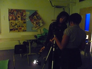
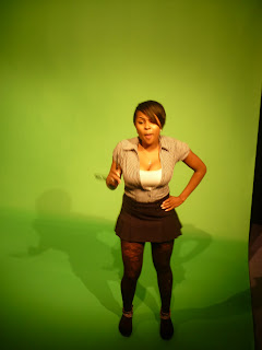
Photos from filming sessions(Production)


The images above are of our filming session throughout the last month.