Wednesday 19 January 2011

Question 4- What have you learned from your audience feedback?


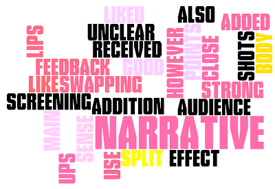
After receiving feedback from my peers and my teachers I have identified the main feedback...


  1. Strong narrative
  2. sometimes narrative was unclear
  3. good use of shots
  4. lighting was too dark in some shots
  5. liked the close ups of lips with added effect
  6. liked split screening in particular body swapping


From audience feedback, I have learned that in some of the shots the lighting is quite dark which contributes to the narrative being unclear at some points, an example of unclear narrative that many people pointed out is the shot where the main artist is seen outside standing in front of a tree and a large veichle stops, so you are not able to see that the artist is then replaced with a different girl, to reinforce the male character's womanizing ways. Another point that people felt was unclear was the cinema shot (see below) where people felt the lighting was too dark to establish what was actually happening in the narrative.  Overall I've learned that the choice of location can largely effect the quality of the shot.

In light of the feedback, for future improvement, I would perhaps reconsider the location as it's naturally quite a dark environment which we didn't initially think would be an issue. As a result of the location we chose it was difficult to convey what was happening in that particular shot, and brightening the shot on the computer would have reduced the quality slightly, so to avoid this in future I would chose a different cinema location that is better lit, to increase the clarity and lighting of these shots.


In some parts of the video it was slightly out of sync. I have learned that the way that the person in front of the camera announciates the words has an effect on putting different shots in sync. As the main artist's announciation was not imitated to the exact way of the original artist's singing  it was difficult to sync it. In light of this feedback I would ensure that the artist is a
announciating the words propperly to ensure it's as similar as it can be to the original in order for the shots to look sharper and more clear cut.

This part of the video can be seen at 00:25 secs

Question 3- How did you use media technologies in the construction, research, planning and evaluation stages

Construction


We used brand new state of the art camera's to film our work.


We saved our work on memory cards and hi-tec  hard drives, which was really efficient as it allowed us to gain access to our work quickly.


Research, Planning and evaluation


I used the internet as a resource for research purposes and to collect screen shots. Such websites include the likes of google where in which I used it to find images of several album covers and advertisement's in order to establish conventions of adverts and digipaks and to gain inspiration. 

I used vimeo to collect screen shots from my video to use in my a number of my blog entries, and to look at past video's for ideas and for analysis. 
In addition to this I also used youtube, in the research stages to look for a song to do our video to and to gain inspiration. I also used it to collect screen shots to use in a number of my blog entries.


Construction of video

We constructed our video using final cut pro using a range of techniques and effects in order to generate our final product. 


This image is a screen shot from one of the shots in our video, originally this had a normal green screen background behind the artist. We opted to change the colour in order to add an element of fun to tie in to the fun vibrant fresh sound of the song. We also used bright colours as we felt they would be very striking and eye catching and would appeal to our target audience of indie pop teens.  We originally found it quite difficult to gage the right level of darkness without the image of the artist becoming distorted and so had to be patient in order to get the correct balance. We used the "chroma keyer" tool to get the right level of brightness and saturation for the green screen shots. We then selected the "colour picker" tool to change the background to a variety of colours, we did this by adding additional filters and changed the colour of these filters. We then added transisitions by selecting the too bar, going into tools and effects then selecting video transition between each colour to create a moving background in order to keep the video interesting and fun.


We toyed around with the brightness and contrast of this clip to increase the quality of the shot as the original clip was quite dark. We added an effect of "dazzle" to the lips. We did this by selecting effects and adding a video filter. We chose to have sweets on the lips because it added a girly and teen feel to it, which again added to the element of fun we tried to create for not only our video but the artist in general. 


Construction of ancillary texts

 I created my digipak in photoshop, to begin with I selected a two pannel template.  I then imported my chosen image and resized it and dragged it to the front pannel. Following this, I used the "magnetic lassoo" tool in order to cut out the silouhette of the artist, at first I attempted to use the magnetic wand, however I found it much more difficult to get an accurate cut out of the artist and so stuck to using the magnetic lassoo tool.  To change the colour of the background from white to pink I selected the "paint bucket" tool. I created the shapes of butterflies and musical notes by selecting the "custom shape" tool.  I then manipulated these shapes by selecting "colour picker" and changing the colours. To add text I selected the "text" tool in the option bar and selected chalk duster, I then added an effect to the text by going to styles and effects. After this I selected "layer styles" in the drop down menu and chose "wow plastic" for the effect.


For the inside left panel I used the elipse tool to create a circle, which acts as the place where the c.d would potentially go, following the same method as explained above to create shapes on both the inside right and inside left panel.


I created my advert in photoshop using the same methods in terms of tools as I did for my digipak. I took a screen shotted image of my artists digipak and incorporated it on my avertisement. 


This is my animatic story board, containing still images of our original ideas created in final cut pro.


How did you use media technologies in the construction, research, planning and evaluation stages


Construction


JVC-GY-HM790-ProHD-camcorder1.jpg 


Research, Planning and evaluation


Sunday 16 January 2011

Feedback from draft evaluation

Hello group 11
You'll find individual comments on each part of your evaluation.  To get to the comments please click on the link '1 comments' at the end of your evaluation blogs.
Keep up the good work.

Wednesday 12 January 2011

Question 1 - In What ways does your media product use, develop or challenge forms and coventions of real media products?


The concept of mixing and matching bodies came from the music video Example - Kickstarts. We thought it would be appropriate for our video as it illustrates the characters and who the artist is being pushed aside for.
At first we were going to put colours on the green screen but after trail and error we thought it looked better as it looked rougher and complimented our video more.


We used the idea of lips to help clarify the different girls and to break up the video too. The idea of using sweets came from a previous students video, but it helped underline and amplify the different girls.


Mariah Careys Heartbreak video had an influence on our storyline. The themes are similar as they are both about a girl who finds out that her boyfriend is cheating on her. We thought using the cinema was a nice touch as it was a quick and easy way to show....
Instead of the artist actually catching her boyfriend and confronting him we decided to leave the ending to the audience by showing her walking off. 


My DigiPak and advertisement are inspired by female artists who have elements of both female characteristics and a side of edginess. My ancillary products show a strong contrast between the pink (female characteristics) and the black (edginess) and I think this indicates that the artist may have a soft exterior but she is tough underneath. 
I think the line through the text is effective because it automatically changes the meaning of sweet and allows the audience to interpret it in the way they want.
An example of this is Pinks album covers, they too show Pink expressing two different sides to her through the use of colours, photos and text. 


How effective is the combination of your main product and ancillary texts?