Showing posts with label Francene Clarke-Walden. Show all posts

Wednesday, 12 January 2011

Question 1 - In What ways does your media product use, develop or challenge forms and coventions of real media products?


The concept of mixing and matching bodies came from the music video Example - Kickstarts. We thought it would be appropriate for our video as it illustrates the characters and who the artist is being pushed aside for.
At first we were going to put colours on the green screen but after trail and error we thought it looked better as it looked rougher and complimented our video more.


We used the idea of lips to help clarify the different girls and to break up the video too. The idea of using sweets came from a previous students video, but it helped underline and amplify the different girls.


Mariah Careys Heartbreak video had an influence on our storyline. The themes are similar as they are both about a girl who finds out that her boyfriend is cheating on her. We thought using the cinema was a nice touch as it was a quick and easy way to show....
Instead of the artist actually catching her boyfriend and confronting him we decided to leave the ending to the audience by showing her walking off. 


My DigiPak and advertisement are inspired by female artists who have elements of both female characteristics and a side of edginess. My ancillary products show a strong contrast between the pink (female characteristics) and the black (edginess) and I think this indicates that the artist may have a soft exterior but she is tough underneath. 
I think the line through the text is effective because it automatically changes the meaning of sweet and allows the audience to interpret it in the way they want.
An example of this is Pinks album covers, they too show Pink expressing two different sides to her through the use of colours, photos and text. 


How effective is the combination of your main product and ancillary texts?


How did you use media technologies in the construction and research planning and evaluation stages?

When constructing, planning, researching and evaluating this project, the use of media played a large role.


Planning:
I used Blogger to record an 'online diary' and to plan and evaluate my work. I think this was extremely useful because it helped me visualise what I pieces of work I had completed and what needed improving. It also encouraged me to criticise my work and make improvements where necessary.

Research:
The Internet was my main source of research. Websites like Google, Wikipedia and YouTube were all helpful and provided me with relevant information and materials to use for my project. I used Google to search for artists when looking for a song to make a video to. I typed things in like "British Artists" to get ideas of groups and solos. Unfortunately I didn't find a lot of information this way, however I did get a few ideas. I also used google to find images of Digipaks and advertisements in order to compare them and utilise them so that I could get a general feel of what mine should be like.
I used YouTube to search for British artists too, I found it easier to find artists because YouTube suggested videos of similar genres down the side after I typed in a song.
I used Wikipedia and Google to research different theories of music videos and to find background information on artists such as their record companies, contact information etc.


Construction:


Music Video
We used brand new state of the art video cameras and memory cards to video our music video and other videos such as; our animatic and videos for the evaluation.
Final Cut Pro was used frequently to edit our video together. I enjoyed using this programme as I found it easy to use. To begin with, we used 'in and out' points to choose what parts of footage we wanted to use and then dragged the clips onto the timeline.
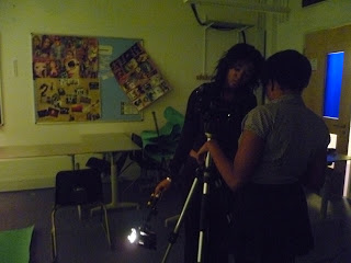
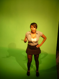
Some of our shots were shot in front of a green screen and so we decided to place different colours in it's place. To do this we used the  'Chroma Keying' tool.
At first we found it quite challenging to get the right level of darkness without the image of the artist becoming distorted. However, after patiently fiddling around with the gages we finally got the correct balance. After this, we selected the "colour picker" tool to insert a variety of colours onto the backgrounds.This was achieved by adding additional filters and changing the colour of them. 
We used transition effects like fading in and out to our video to make it interesting to watch.   I found this very easy to do as the steps were simple. There were also many choices of transitions to choose from such as; additive dissolve, dissolve and 3d spin which is my favourite. Transitions were found by going to effects and then video transitions. 
Another effect we used in our music video was 'Dazzle'. This can be seen on the lips. We thought this effect was suitable because it made the sweets stand out more. 
The screen shot below shows how we did this.
How we added the 'Dazzle' effect
We also used the split body idea in our video.This was achievedby mixing different faces and bodies.
The crop key was used to cut out the parts of the persons body I wanted to use. The images were then placed on top of each other on the time line so when the footage was played it appeared as one person.
We decided that this looked better uneven and out of line as it suggested that our artist isn't perfectly cut.


Our animatic:


Ancillary Products 

I used Photoshop to create my DigiPak and advertisement. I started of with a 4 panel template and layered them with images.
I used the "Magnetic Lasso" tool to 'cut out' the image on the front cover. I think this tool was very easy to use as the lasso almost stuck to the image making it easier to get a precise cut.
I used the 'Diffuse' effect on the back cover as it was subtle and didn't make the image look tacky.
I tried not to use too many effects as I thought it was important for her face to be clear as she is a new artist.
I found the gender symbols in the custom shapes and decided that they would compliment my products. I inserted them by simply dragging them onto the top layer.
The text was created using the 'text box' tool, I trialed different fonts before choosing chalk duster as I thought this was most effective.The 'strikethrough' was achieved by using the shape tool to draw a line through the word 'Sweet'.


 Evaluation:
For my evaluation I used Blogger to record everything I have done and learned throughout the process. I took various screenshots of websites such as 'Youtube' and 'Google', programmes like 'FinalCut Pro' and 'Photoshop' to help illustrate my experience in creating this project.
Overall I am happy with all of my products including my Blog as I believe I worked hard to achieve them.
If I had another chance to do this again, I would be more creative with both my products and my blog as I feel my work had the potential to be more original.

What have you learned from your audience feedback?

We screened our video in class and asked our peers to write down what they thought of the video. Most people said they liked the use of colour, however some of lighting in shots could have been improved. This Wordle shows the most common comments.

When analysing the comments made, I have learned that the colours we used in the backgrounds play an important role as they make the video more eye catching and keeps the audience interested. Another point that stood out to me was lighting as some of our shots were quite dark. For example the cinema shots and the outdoor shots by the tree. This could have been improved by carefully choosing well lit locations or using artificial lights when necessary. We could have also visited the locations at the time we wanted to film at to check out the lighting to plan ahead.
The audience expressed that they enjoyed the narrative side to our video as it was easy to relate to. They also liked the idea of using the cinema.
The body matching shots were also popular with the audiences as it was humorous and helped indicate the different characters in the video.
Some of the audience noticed that parts of the video were out of sync, however this was due to me not announciating the words properly. This could have been easily avoided by making sure that I sang in the same style each time we filmed.


"The video kept me interested because of the bright colours and changes of location"


"Some of the shots were a bit dark"


"The video was funny and reminded me of my friends ex boyfriend!"


Screen+shot+2011-01-19+at+12.57.06.png
Example of dark shot
Screen+shot+2011-01-19+at+14.16.43.png
Example of colour used in the video

Thursday, 6 January 2011

Final Digi Pak and Advertisement (Product)

After researching pop artists I found that the usual conception of female artists having extreme close ups and looking directly into the camera was continuous. However, I decided that our artist didn't need to be that intimate with the audience as I wanted to express that although she had feminine characteristics, she also had a hard side too. I also decided not to use shots from the actual video because I wanted to connect it to the music video using other discreet elements (e.g male and female symbols, costumes).

Overall  I am happy with my Digi Pak, however if I had a chance to do it again I would try to link the pak more visually to the video as I feel that the connection isn't obvious.

The front cover consists of the main artist (4lw) and the album title. It also tells the customers that  'That's not my name' is featured in the album. I decided to use these colours because we used a variety of colours in our video and I think they stand out. The title ' Sweet Revenge' is bitter sweet which also describes 4lw and is contradictory to the colour scheme. I think this works because it suggests that 4lw has two sides to her.  
The back features a track list and the male/female symbols are carried through for consistency. She is signed to Island Records because we found that similar artists are also signed to that label. 

The inside of the Digipak has a Thank you page and quotes from the song 'Thats not my name'. It shows a picture of her straight on interacting with the audience. I used this photo because I thought that the audience would be able to relate with her as she shows a softer side to her. 


Short list of potential fonts and colours (planning)

FONTS


COLOURS

PINK
ORANGE
PURPLE
*  BLACK
YELLOW

Wednesday, 5 January 2011

Photos for Digi Pak and Advertisement.

We had a selection of photos to choose from:


DigiPak Mock Up (Planning)

Before designing  our Digi Paks we were asked to draw out designs of what we thought would represent our artist effectively. My first design was..


However after analysing it carefully, I decided to make a few small changes. Firstly, I read thought the track list again and found that most of the songs were based around relationships so it would be necessary to include this element  on the digi pak.
Another thing i decided to change was the colour scheme Idecided to go for softer colours to show her softer side. The album title Sweet Revenge' is quite sinister so I decided to put a line through 'sweet' to imply that her revenge will not be sweet at all.

The plan for my advertisement was to use the CD cover as the background. I opted out of creating tour dates because I decided that my artist is too unestablished to do a tour. So I thought ratings were more suitable.

Overview's of Do's and Don'ts of design work (planning)

Before creating our Digi Paks and Adverts we were given some tips that would help us desgin suitable products:


*Use a clear font
*Use an appropriate image in terms of both size and appearance of image
*Plan effectively
*Use time efficiently
*Be creative
*Think carefully about positioning of image and text
*style of text should follow typical media conventions
*Possibly establish visual links to in order audience to identify with artist
*Act on feedback and constructive criticism
*Don't use inappropriate images or fonts that do not represent the genre or followbasic media conventions
*Don't stretch images as it reduces the quality
*Don't spend too long on one thing, if it doesn't work move on and try something else.
*Don't try to be too ambitious if it isn't feasible.

Sunday, 12 December 2010

Analysis of Final Video

As a whole, I think our video went quite well. We stuck to the main idea that we pitched and tried to get the story across as much as possible.
If we had another opportunity to do this again, I think I would pay more attention to planning and time keeping as I feel we spent a lot of our time filming. As a consequence, we didn't have a lot of editing time and had little time to re-shoot shots that were too dark or un-useful.
To improve our video I think I could have performed the song better as I feel this would have made it stronger.

DigiPak (plannig)

We decided to go for a brightly coloured theme for our digipak to express our artists character and individuality. We thought neon colours like pink, yellow and green would stand out as well as link to the video. We also thought including lips on the pak would make it easier for the audience to relate and identify the two with.

The artist is outgoing, edgy and independent and we wanted this to show in the track titles. Below are a few titles we ahve chosen for the back cover:
*So What?
*H.A.T.E
*On the edge
*Late night

Here is a picture of what I feel would be effective for our digipak.

Final Video Feedback

After our music video was screened at the cinema, we filmed a few people on there feedback and opinions on it.
(video will not upload)

Tuesday, 7 December 2010

Analysis of Advertisments (Research)


I chose this advertisement because there is a strong correlation with the album cover. This is significant because it allows fans to identify the two and in turn encourages them to buy the CD or attend the concert. The colours used are quite bold and sinister and they are carried across the two products. The same picture on the CD is used at the centre of the advertisement to draw attention to the artist. I think they work well together because you can immediately recognise their similarities.   Themes used in these products are also used throughout the artists music videos.


This advert is very eye catcthing, the use of graphics and colour automatically indicate that the genre of the music is pop. A picture of Madonnas album is featured in the bottom corner and exhibits the same themes. Although she is striking different poses, she is wearing the same outfit which makes it incredibly easy to identify with. Madonnas name is the largest text on the advert, followed by the tours name. This is done  so that the audience can see what the artists name is and not be confused with the tour title.

Wednesday, 1 December 2010

Ananlysis of 3 digipaks


This cover of Katy Perry features her looking straight into the camera which is a common convention of females artists. She is wearing a revealing pink outfit and is surrounded by things associated with girl's. This is contradictory to her album title 'One of the boys'.
however, the lighting is quite dark which brings elements of manliness and indicates that she has a sinister side.

I chose this Digipak as it is a contrast to the previous one. Its colour scheme is very calming, the lighting is used in a way to reflect off of the guitar. The guitar and colours are used throughout the Digipak which shows consistancy and carries the same theme. The cover doesnt feature the band, however they are well established and the guitar brings a rock element which indicates the genre.

This Digipak is based around the same themes as our artist. It has two contrasting colours, grey and pink which compliment eachother and suggest that Pink has a dark and edgy side to her.The picture of Pink is very fierce and makes her look strongand independent.